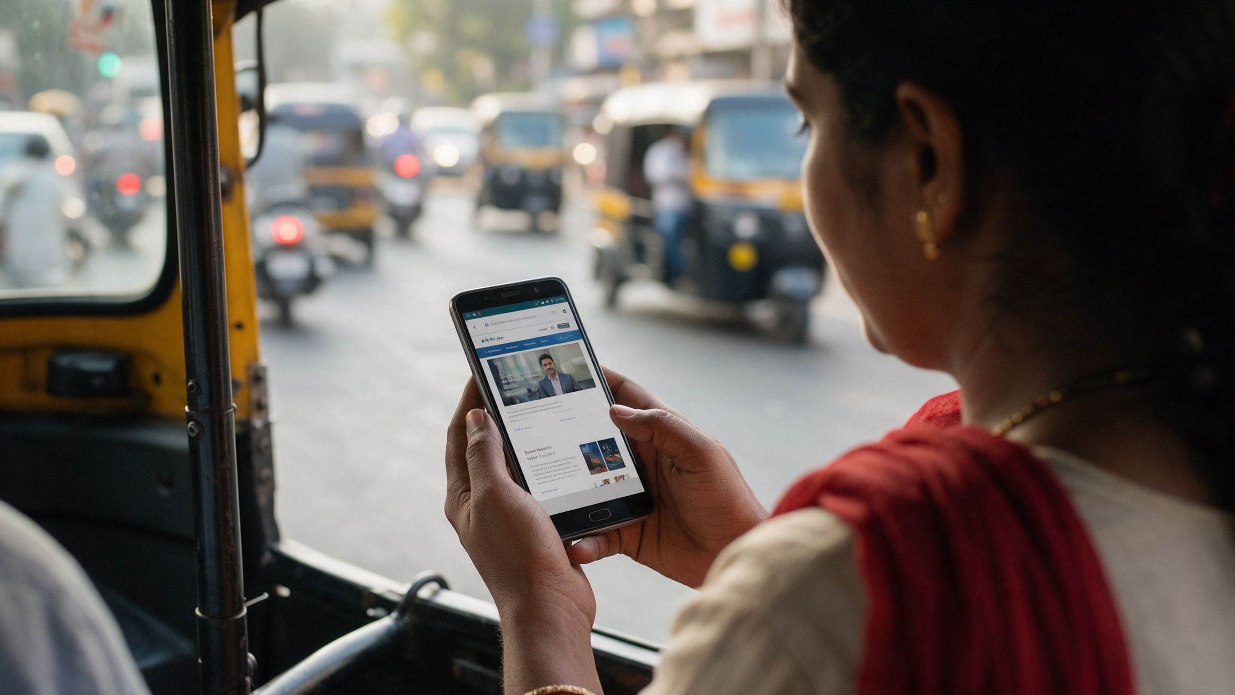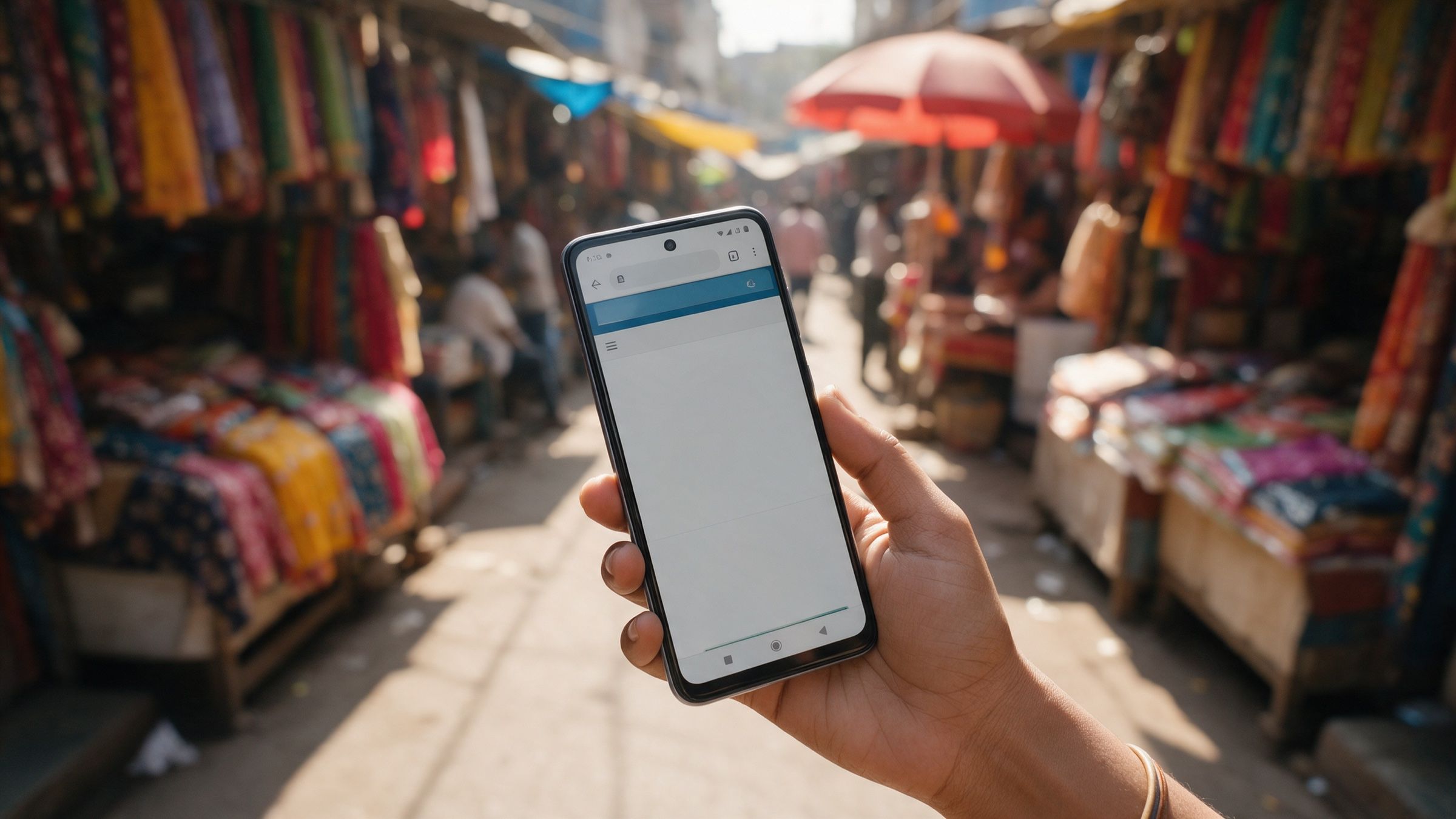
Open your website on the phone you carry. Now open it on a ₹12,000 Android, on mobile data, in a lift or a moving car. If the second experience is a different product, you have found the gap this post is about. Good mobile website design in India starts with accepting that the second experience is the one most of your prospects get.
“Mobile-friendly” and “mobile-first” sound like the same promise. They aren’t. One describes a layout that doesn’t break on a small screen. The other describes a decision about who the site is for.
Why mobile-first India is the default, not a segment
The numbers are large enough that it is easy to stop reading them. The IAMAI-Kantar Internet in India study, as reported by Business Today, put India’s active internet users at about 958 million in 2025, up roughly 8% on the year. Rural India accounts for about 548 million of them, and is growing nearly four times as fast as urban India. The study surveyed more than 87,000 consumers across over 400 towns and 1,000 villages.
The regulator’s own data points the same way. TRAI’s release for August 2026 counts 1,052.58 million wireless broadband subscribers (including M2M connections) against 48.63 million on wireline. Almost all broadband in India is wireless.
Your prospects are not only in Bandra or Koramangala. The same TRAI release puts urban tele-density at 146.66% and rural at 60.55%. A distributor in Nashik, a clinic owner in Coimbatore and a procurement head in Gurugram may all open your link on very different phones, on very different networks, in very different moods.
We can’t give you a reliable market-share figure for “the typical phone”, and we won’t invent one. What we can say from experience is that a mid-range Android in the ₹10,000 to ₹15,000 range is a sensible stand-in for your median visitor. It has a modest processor, limited memory and a screen that is bright enough but not generous. Design for that phone and the flagship takes care of itself. The reverse is not true.
Mobile-friendly vs mobile-first, in practice
| Mobile-friendly | Mobile-first | |
|---|---|---|
| Starting point | The desktop design | The phone, the thumb and the network |
| Typical symptom | Pinch-zoom, tiny links, huge hero image | Short load, one clear action per screen |
| Contact | A “Contact us” page | A call or WhatsApp button always in reach |
| Tested on | A laptop with the browser window narrowed | A real phone, on real data |
| Copy | Written for a desktop skim | Short, scannable, often in two languages |
A mobile-friendly site passes Google’s checks. A mobile-first site feels like it was made for the person holding it.
Speed: the numbers that matter
Google publishes the targets in its Core Web Vitals guidance on web.dev. A page is considered good when, at the 75th percentile of real visits:
- Largest Contentful Paint (when the main content appears) is within 2.5 seconds
- Interaction to Next Paint (how quickly it responds to a tap) is 200 milliseconds or less
- Cumulative Layout Shift (how much things jump around) is 0.1 or less
Notice “75th percentile”. It means three in four visits must meet the target, which is why testing only on your own fast phone gives false comfort. The slow quarter of your visitors is the part that decides whether you pass.
Human in the loop: AI tools will happily generate a beautiful page with a 4 MB hero video, three font families and a carousel. Someone with experience has to look at the weight, ask what each element earns, and delete the ones that don’t. That judgement is not automatic.
Mobile website design in India: the checklist we use
None of this is exotic. It is simply easy to skip when everything is previewed on a laptop.
1. Page weight. Set a budget before design starts. Many teams aim for a first screen that loads in well under a megabyte, then add only what earns its place. Every extra script, widget and tracking pixel is paid for in seconds on 4G. Ask what each one is for and who reads its report.
2. Images. Serve modern formats such as WebP or AVIF, at the size they are displayed, not at the size the designer exported. Never lazy-load the main image at the top of the page: web.dev’s LCP guidance says that always delays loading and hurts the score, and recommends marking that image as high priority. Lazy-load everything below the fold.
3. Fonts. Two weights of one family is usually enough. Self-host them, subset them to the scripts you need and make sure text shows immediately in a fallback font while the real one loads. A page that stays blank while a font downloads feels broken.
4. Tap targets. Buttons and links should be comfortably large, with space between them. Think of a thumb on a moving auto-rickshaw, not a mouse. Put the primary action where the thumb rests, in the lower half of the screen.
5. Sticky WhatsApp and call buttons. For many Indian businesses, the most natural first contact is a call or a WhatsApp message, not a form. A button that stays in reach, with a pre-filled message such as “Hi, I’d like to know more about your services”, removes a whole step. Test that it opens the right app on both Android and iPhone.
6. Forms that respect the phone. Use the numeric keypad for phone numbers, the email keyboard for email, and autofill attributes so the phone can fill the name and number in one tap. Ask for as little as you need. Every extra field is a reason to leave, and a phone number plus a name is often enough for a first conversation. If you collect personal data, the DPDP Act means you should say plainly what you will do with it and ask for consent in clear language.
7. Vernacular and Hinglish copy. Plenty of your prospects read English comfortably and still decide faster in Hindi, Marathi, Tamil or Hinglish. You don’t need to translate the whole site. Start with the headline, the main call to action and the form labels. Machine translation gets the words right and the tone wrong more often than you would expect, so have a native speaker read it before it goes live.
8. Payment and trust cues. If you take payments, UPI should be the first option, not the fourth. If you quote prices, say whether GST is included. Show a real address, a phone number that rings and a face or two. On a small screen, these reassurances do more than a long About page.
9. Fewer popups, steadier layout. Cookie banners, chat widgets and offers that load late push the content down just as someone goes to tap. That is exactly what Cumulative Layout Shift measures, and it is infuriating on a phone.
Test on the phone, not the preview
Browser developer tools can throttle the network and shrink the viewport, and they are useful for quick checks. They are still running on your laptop’s processor and memory, which are far faster than your visitor’s phone.
So do the simple, slightly unglamorous thing:
- Get hold of a mid-range Android in the ₹10,000 to ₹15,000 range and keep it in the studio or the office.
- Switch off Wi-Fi and use ordinary 4G. Better still, test indoors, at the back of the building.
- Load your home page and one service page. Count the seconds to something useful.
- Try to call, message and submit the form with one thumb.
- Note every moment you hesitated. Those moments are your to-do list.
For field data rather than a single test, look at Google’s real-user reports for your own site in Search Console and PageSpeed Insights, which show how visitors on actual devices experienced your pages.
Human in the loop: tools can score a page, but a person has to decide which compromise is right. Is the video worth two seconds? Is the second language worth the extra upkeep? We make those calls with the client, on a real phone, and a senior designer signs them off.
How we approach it
At Cannyworx we use AI to speed up the heavy lifting: first layouts, image handling, draft copy, accessibility and performance checks. The decisions that shape the experience stay with experienced people. A senior designer reviews every page on real devices before it ships, because a preview on a laptop cannot tell you how a page feels in a visitor’s hand.
Where to start
You don’t need a redesign to learn where you stand. Take your own home page, a mid-range Android and a mobile data connection, and write down the first five seconds as a stranger would see them. What loads? What can they tap? Could they reach you in two taps?
If you’d like a structured way to do it, the free first-impression audit below walks you through exactly that, page by page, and leaves you with a short, prioritised list of fixes.
Questions people ask
What is the difference between mobile-first and mobile-friendly design?
A mobile-friendly site is a desktop design that shrinks to fit a phone. A mobile-first site is designed for the phone screen, thumb and network first, then expanded for larger screens. The first usually works; the second is usually faster and easier to act on.
What are good Core Web Vitals scores for a mobile website?
Google's web.dev guidance is Largest Contentful Paint within 2.5 seconds, Interaction to Next Paint of 200 milliseconds or less and Cumulative Layout Shift of 0.1 or less, measured at the 75th percentile of real visits.
How should I test my website on mobile in India?
Open it on a real mid-range Android phone over ordinary 4G, not office Wi-Fi, and try the tasks a prospect would try: read, tap, call, fill the form. Emulators and laptop previews help, but they hide the slowness your visitors actually feel.