Your prospect has not read your pitch, your client list or your pricing. They have opened your link from a WhatsApp forward or a Google result, and something in them has already made a call. That call is your website first impression, and it forms much faster than most founders assume.
This post covers what the research actually says (and doesn’t), what visitors seem to be reacting to, and a practical checklist for the first screen of your site on a phone.
What the 50-millisecond study measured
The number comes from a 2006 paper by Gitte Lindgaard, Gary Fernandes, Cathy Dudek and J. Brown, “Attention web designers: You have 50 milliseconds to make a good first impression!”, published in Behaviour & Information Technology.
It is worth being precise about it, because it is often quoted loosely. The researchers showed people web homepages for very short times and asked them to rate visual appeal. In the first studies each page was shown for 500 milliseconds. In a later study they added a 50 millisecond condition with the same pages. Ratings given after 50 ms were highly correlated with ratings given after 500 ms. Their conclusion: visual appeal can be assessed within 50 milliseconds.
So what was measured is how appealing people found a page to look, not whether they would trust or hire you. Fifty milliseconds is a twentieth of a second, well under a blink. Nobody reads anything in that time. What they register is colour, layout, density and overall feel.
That is a narrower claim than “visitors decide everything in 50 ms”, and it is the honest one. But it matters, because that first reaction is the lens through which people then read everything else.
What they are reacting to: simple and familiar
Researchers from the University of Basel and Google followed this up. Tuch, Presslaber, Stöcklin, Opwis and Bargas-Avila’s 2012 paper, “The role of visual complexity and prototypicality regarding first impression of websites” (International Journal of Human-Computer Studies), tested 119 screenshots of real websites. Pages differed in two ways:
- Visual complexity: how much is going on (elements, colours, density).
- Prototypicality: how much the page looks like what people expect a site of that kind to look like.
Screenshots were shown for 50, 500 or 1,000 milliseconds, and people rated how aesthetically appealing they were. Both factors affected ratings even at 50 ms, and pages with low complexity and high prototypicality were rated as most appealing. Google’s own write-up put it plainly: users strongly prefer designs that look both simple and familiar.
Notice what this does not say. It does not say “be plain” or “copy everyone”. It says that a cluttered first screen, or one that confuses the visitor about what kind of business this is, starts at a disadvantage. Familiar structure, distinctive expression: that is the balance.
Also keep the limits in mind. These are lab studies of appeal ratings on screenshots. They tell us about the gut reaction, not about conversion rates on an Indian lead form. We treat them as a strong reason to check the first screen carefully, not as a formula.
Your website first impression happens on a phone
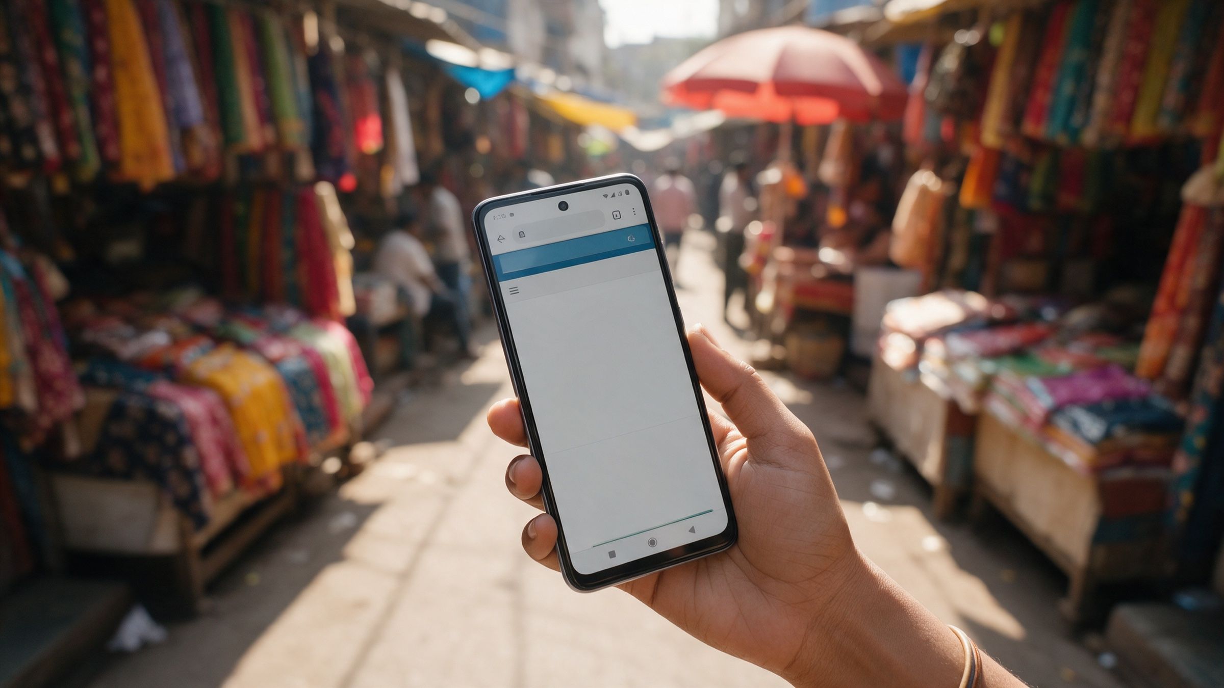
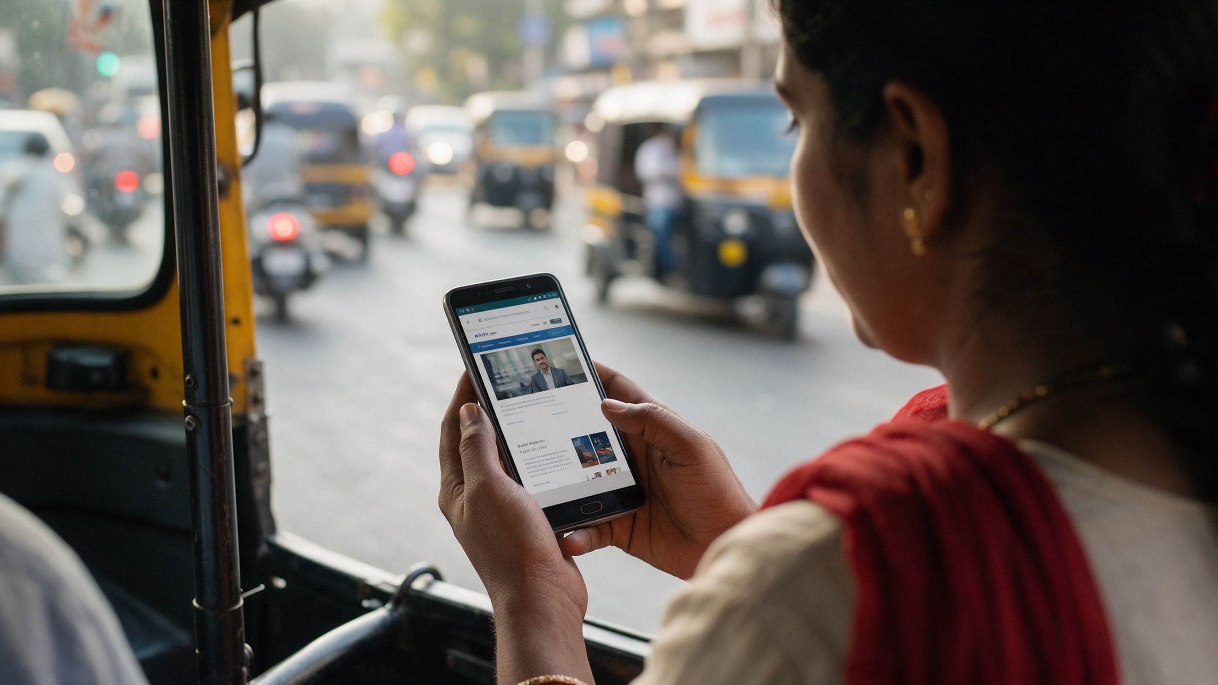
Most of your Indian prospects will first meet you on a phone, often a mid-range Android on 4G that wobbles between bars. The “above the fold” area there is small: roughly one screen of about 360 pixels wide, with a browser bar and sometimes a cookie banner taking a chunk of it.
Desktop-designed sites often fail here in quiet ways. The hero image is a heavy slider that loads late. The headline wraps into five lines. The logo, menu and a chat bubble fight for the same corner. Each one adds complexity at exactly the moment the visitor is making their gut call.
Human in the loop: an AI tool can generate a clean-looking hero in seconds. What it cannot do is sit with your brand and decide what should dominate that first screen, whether it is your promise, your proof or your product. A senior designer makes that choice and checks it on a real phone.
A first-screen checklist for your phone
Open your site on an actual mid-range phone, not a desktop browser squeezed narrow. Use mobile data, not office Wi-Fi. Then check the first screen, before scrolling, against these points.
1. The five-second recall test. Look at it for five seconds, lock the phone, and write down what the business does, who it is for and what to do next. If you or a colleague can’t, the page is asking too much.
2. One headline, one job. The headline should say what you do for whom, in plain words. “Welcome to our company” and “Innovating tomorrow” tell a visitor nothing.
3. One primary action. Usually a single button: “Talk to us”, “Get a quote”, “WhatsApp us”. Two competing buttons are fine; five are not. Make the tap target comfortably large for a thumb.
4. Visible speed. Something meaningful should appear quickly on 4G. Heavy sliders, autoplay video and unoptimised photos are the usual culprits. Google’s Core Web Vitals (Largest Contentful Paint, layout shift) are a reasonable measure here, and the free PageSpeed Insights tool reports them.
5. Nothing jumps. If text moves as images load, or a banner pushes the button down just as someone taps, it reads as careless within a second.
6. Familiar structure. Logo top-left, menu behind the usual icon, contact easy to find. Be distinctive in your visuals and voice, not in where the menu hides.
7. Legible contrast and type. Body text readable outdoors in daylight, which is how many people use their phones. Avoid thin grey text on white.
8. Proof within reach. A recognisable client logo, a number you can stand behind, a certification or a GST-registered company name in the footer helps. It need not fill the screen; it must be findable without hunting.
9. A real human signal. A named person, a real office address, a WhatsApp number that someone answers. Visitors in India are alert to enquiry forms that vanish into silence.
10. Consistent with your other touchpoints. If the site’s look doesn’t match your pitch deck, LinkedIn page and invoice, it feels like three different companies. Consistency reads as scale.
| Quick check | What good looks like | Common failure |
|---|---|---|
| Headline | Says what you do, for whom | Slogan with no meaning |
| Action | One clear button | Menu, chat, popup and banner together |
| Load | Content visible fast on 4G | Heavy hero slider |
| Stability | Nothing shifts | Layout jumps as images arrive |
| Proof | Logo, name or number in view | Testimonials buried below |
Why defaults drift to average
There is a reason sites built from templates and generated layouts so often look alike. Tools learn from what is common, so they produce what is typical. That helps with the “familiar” half of the research. It is exactly wrong for the other half of what a business wants, which is to be remembered.
An average first screen is rarely a bad one. It is a forgettable one, and for a founder who wants the business to look 10× bigger, forgettable is the expensive outcome.
Human in the loop: AI is useful for drafting layouts and trying variations quickly. The decision about which variation expresses your brand, and which details to cut, belongs to a person who has seen what works for businesses like yours.
At Cannyworx, this is how we work on websites: AI speeds up the drafting and the variations, and a senior designer reviews the first screen on real phones, on real networks, before anything goes to the client for sign-off. We don’t claim that this guarantees conversions. It does mean someone with experience has looked at your first impression with your brand in mind.
What you can fix this week
You don’t need a redesign to improve a first impression. In most audits the quick wins are the same:
- Rewrite the headline so it says what you do and for whom.
- Remove one or two things from the first screen (a second button, a rotating banner, a pop-up that appears at once).
- Compress the hero image and drop autoplay video.
- Fix anything that shifts while loading.
- Add one proof point that a stranger can see without scrolling.
Re-run the five-second recall test afterwards, ideally with someone who has never seen your site. Their answer is worth more than your own opinion.
Where to start
Start with the phone in your hand. Open your own site, run the five-second test, and go through the checklist above with a pen. Note which of the ten points fail, then order them by how visible they are on the first screen.
If you’d like a structured version, the free first impression audit below walks through the same checks in about fifteen minutes and gives you a list to act on, or to hand to whoever manages your site.
Questions people ask
How long does it take to form a first impression of a website?
In Lindgaard and colleagues' 2006 experiments, people's ratings of a page's visual appeal after 50 milliseconds closely matched their ratings after 500 milliseconds. So a rough judgement of how appealing a page looks can form in a fraction of a second.
What makes a website look good at first glance?
Research from Google and the University of Basel found that pages with low visual complexity and high prototypicality (simple and familiar-looking) were rated as most appealing. In practice: fewer competing elements, and a layout that behaves the way visitors expect.
How do I check my website's first impression on a phone?
Open it on a mid-range Android phone on mobile data, look at the first screen for a few seconds, then look away and write down what the business does and what to do next. If you can't, a visitor can't either.